utf-8 works for most cases
Forcing initial-scale shouldn't be necessary
Use the latest (edge) version of IE rendering engine
Disable auto-scale in iOS 10 Mail entirely
~MESSAGE.SUBJECT~ | ~MESSAGE.PREHEADER~
Web Font / @font-face : BEGIN
[if mso]>
>
/* What it does: Remove spaces around the email design added by some email clients. */
/* Beware: It can remove the padding / margin and add a background color to the compose a reply window. */
html,
body {
margin: 0 auto !important;
padding: 0 !important;
height: 100% !important;
width: 100% !important;
}
sup, sub {
vertical-align: baseline;
position: relative;
top: -0.2em;
}
/* What it does: Stops email clients resizing small text. */
* {
-ms-text-size-adjust: 100%;
-webkit-text-size-adjust: 100%;
}
/* What it does: Centers email on Android 4.4 */
div[style*="margin: 16px 0"] {
margin: 0 !important;
}
/* What it does: Stops Outlook from adding extra spacing to tables. */
table,
td {
mso-table-lspace: 0pt !important;
mso-table-rspace: 0pt !important;
border-collapse: collapse;
mso-line-height-rule: exactly;
}
/* What it does: Fixes webkit padding issue. Fix for Yahoo mail table alignment bug. Applies table-layout to the first 2 tables then removes for anything nested deeper. */
table {
border-spacing: 0 !important;
border-collapse: collapse !important;
table-layout: fixed !important;
margin: 0 auto !important;
}
table table table {
table-layout: auto;
}
/* What it does: Uses a better rendering method when resizing images in IE. */
img {
-ms-interpolation-mode: bicubic;
}
/* What it does: A work-around for email clients meddling in triggered links. */
*[x-apple-data-detectors],
/* iOS */
.x-gmail-data-detectors,
/* Gmail */
.x-gmail-data-detectors *,
.aBn {
border-bottom: 0 !important;
cursor: default !important;
color: inherit !important;
text-decoration: none !important;
font-size: inherit !important;
font-family: inherit !important;
font-weight: inherit !important;
line-height: inherit !important;
}
/* If the above doesn't work, add a .g-img class to any image in question. */
img.g-img+div {
display: none !important;
}
/* Create one of these media queries for each additional viewport size you'd like to fix */
/* iPhone 4, 4S, 5, 5S, 5C, and 5SE */
@media only screen and (min-device-width: 320px) and (max-device-width: 374px) {
.email-container {
min-width: 320px !important;
}
}
/* iPhone 6, 6S, 7, 8, and X */
@media only screen and (min-device-width: 375px) and (max-device-width: 413px) {
.email-container {
min-width: 375px !important;
}
.fix-padding {
padding: 10px 0 0 0 !important;
}
}
/* iPhone 6+, 7+, and 8+ */
@media only screen and (min-device-width: 414px) {
.email-container {
min-width: 414px !important;
}
}
CSS Reset : END
Progressive Enhancements : BEGIN
Progressive Enhancements : END
[if mso]>
96
[if mso | IE]>
IMAGE FULL WIDTH : END
1 COLONNE TXT + CTA : BEGIN
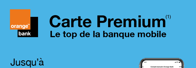
Offrez-vous le meilleur de la banque mobile
1 COLONNE TXT + CTA : END
IMAGE FULL WIDTH : BEGIN
IMAGE FULL WIDTH : END
INFO NON OPTIN FR: BEGIN
(1) Carte payante délivrée après accord d’Orange Bank. Voir conditions et tarifs en vigueur sur orangebank.fr
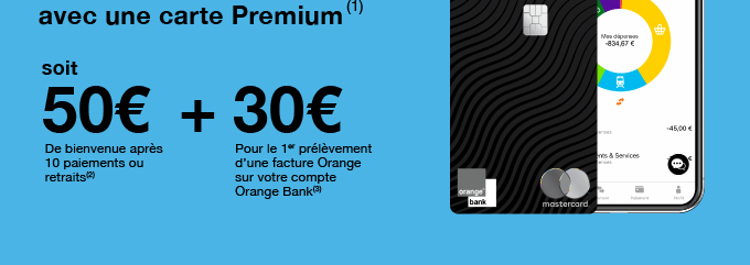
(2) Offre de bienvenue de 50 € : à partir de 10 paiements ou retraits réalisés avec une carte Premium(1) et/ou le paiement mobile* Orange Bank avant la fin du 1er mois qui suit l'ouverture effective d'un 1er compte bancaire "Nouvelle offre Orange Bank" avec une carte Premium(1) et/ou dans le cadre de la souscription d'un 1er Pack Premium**, entre le 02/06/2021 et le 06/10/2021 inclus. Prime de 50€ créditée dans les 30 jours suivant la 10e opération, dans la limite d'une prime par personne.
(3) Prime de 30€ pour tous clients Orange internet ou mobile en France Métropolitaine et dans les Départements et Régions d'Outre-Mer, qui ont mis en place le prélèvement d’une facture Orange sur leur 1er compte bancaire « Nouvelle offre Orange Bank » dont l’ouverture effective avec une carte Premium(1) et/ou dans le cadre d’un 1er Pack Premium**, a eu lieu entre le 02/06/2021 et le 06/10/2021 inclus, et sous réserve que le 1er prélèvement se présente dans les 3 mois suivant l’ouverture du compte. Prime de 30€ créditée dans les 30 jours suivant la présentation du prélèvement, dans la limite d’une prime par personne. Informations sur le prélèvement dans les conditions générales banque au quotidien "Nouvelle offre Orange Bank" disponibles sur orangebank.fr.
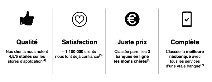
(4) Apple Store & Google Play App Store – Janvier 2021
(5) Orange Bank – Février 2021
(6) Moneyvox - Février 2021
(7) cnetfrance.fr - Février 2021
*Paiement mobile soumis à conditions, réservé aux titulaires d’une carte bancaire «Nouvelle offre Orange Bank». Sous réserve de compatibilité des équipements. Voir conditions sur orangebank.fr. Apple Pay est une marque déposée d'Apple Inc. Google Pay est une marque déposée de Google Inc.
**Offre groupée de services, sous réserve d’acceptation par Orange Bank. Voir conditions et tarifs sur orangebank.fr.
Orange Bank - SA au capital de 924 775 712 € - 67 rue Robespierre - 93107 Montreuil Cedex - 572 043 800 RCS Bobigny – Orias n°07 006 369 (www.orias.fr)
INFO NON OPTIN FR: BEGIN
Cette prospection commerciale vous est adressée par notre partenaire pour le compte d’Orange Bank qui est responsable de ce traitement. Orange Bank n’a pas accès à vos données. Seul notre partenaire dispose de vos données. Vos données sont uniquement susceptibles d’être collectées par Orange Bank si vous décidez de profiter de l’offre proposée dans cet email. Conformément au RGPD, vous disposez d’un droit d’accès, de rectification, d’effacement, de limitation d’opposition et de portabilité de vos données, que vous pouvez exercer à tout moment auprès de notre partenaire.
Vous recevez cet email car vous êtes abonné aux newsletters de mes offres du moment enregistré auprès de la CNIL sous le numéro 1834090. Conformément à la Loi Informatique et Libertés numéro 78-17 du 06/01/1978, vous disposez d’un droit d’accès, de rectification et de suppression des données vous concernant. Vous pouvez exercer ce droit en utilisant le lien de désinscription fourni dans cet email par le propriétaire de la base email, pour en savoir plus Cliquez ici Desinscription